Transparent employer branding
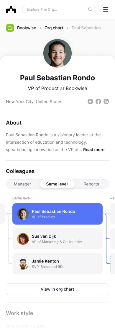
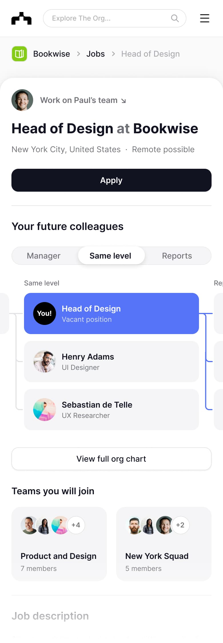
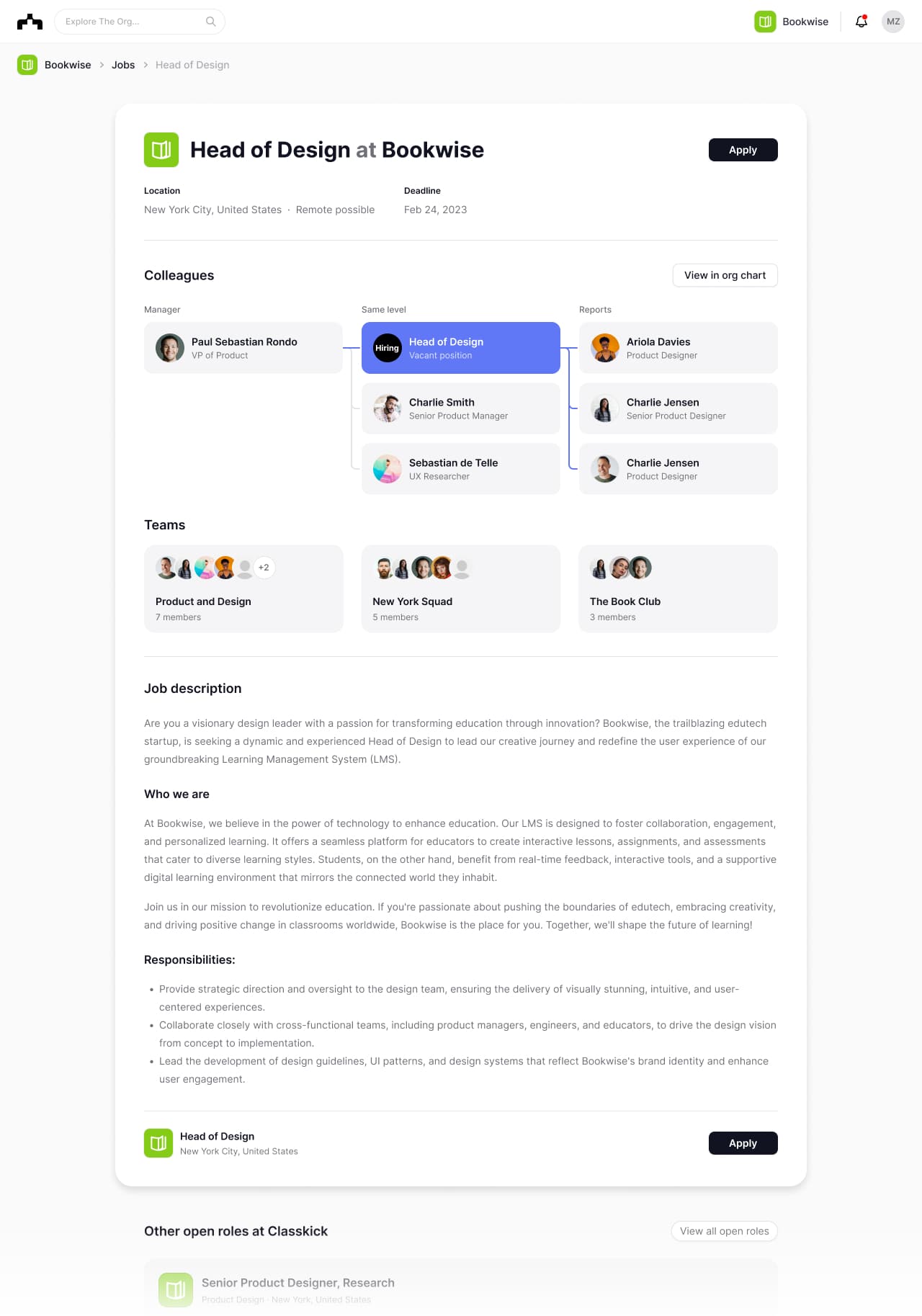
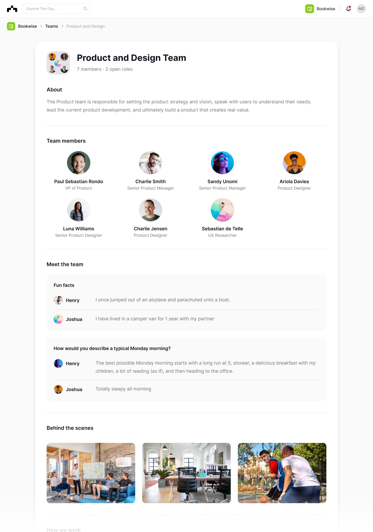
The Org, 2023Every company is competing to hire the best talent. At The Org I helped build an employer branding platform where companies attract new talent by being radically transparent about their team and how they work. Because great people want to work with great people.
Thousands of companies are on The Org today and the public profiles get >1 million organic visits/month.
Primary designer: Alexander Juhl ↗. My role: Working closely with Design and leading the product development.

Dashboard
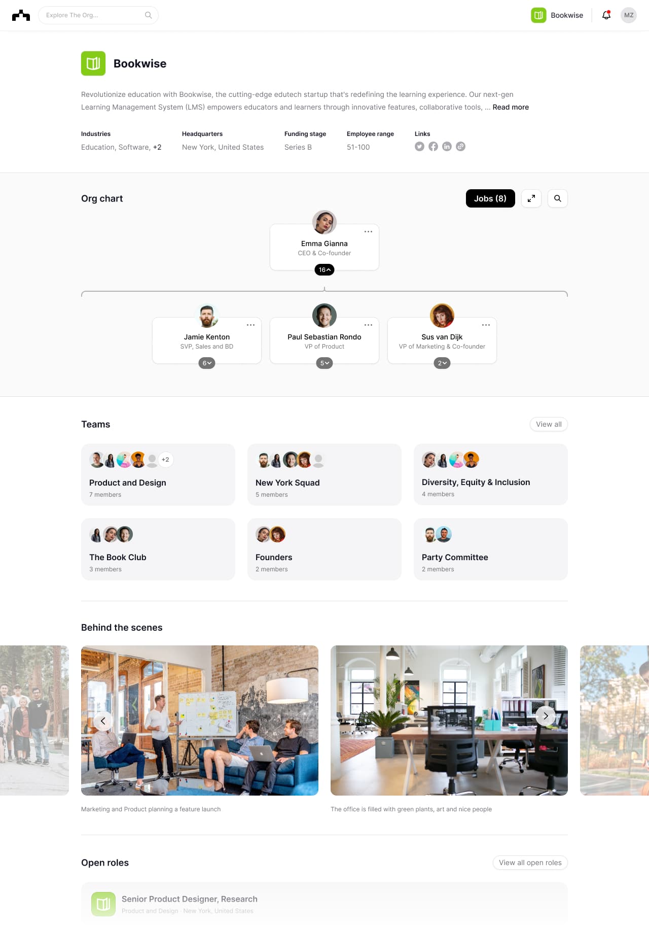
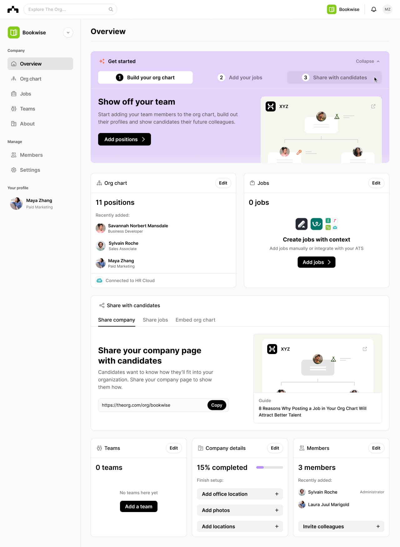
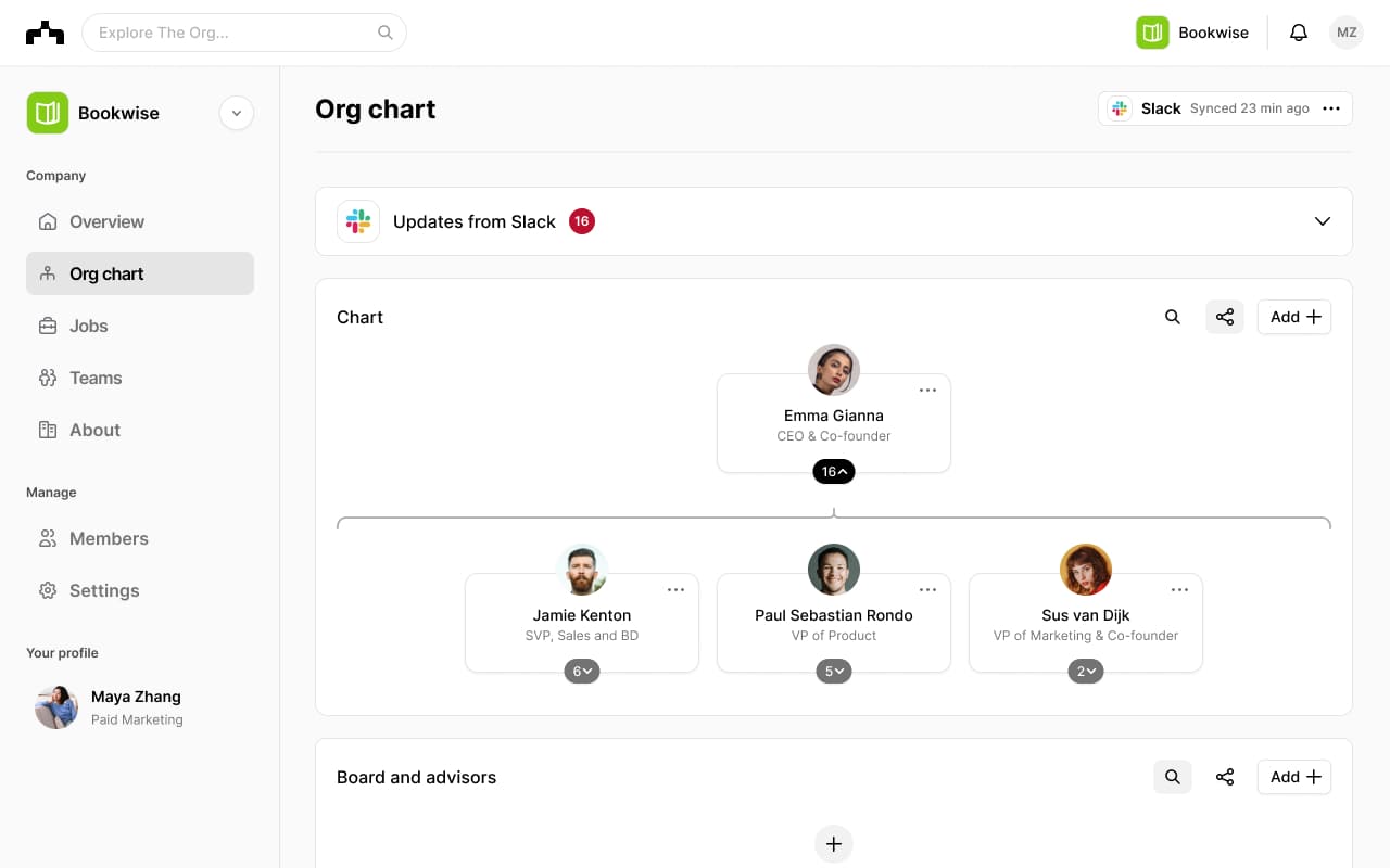
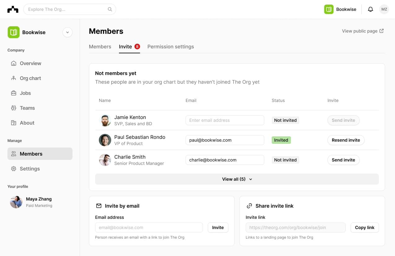
The Org, 2023Companies on The Org asked for better user onboarding and an easier way to build their profiles. We built a Dashboard to solve those problems. A lot of work went into the integrations that can pull in all relevant data from your Slack, HRIS and ATS.
The release improved the user activation rate and made companies fill out more of their profile.
Primary designers: Carl Ejlers ↗ and Mikkel Sonnenschein ↗. My role: Working closely with Design and leading the product development.

Keyless car rental
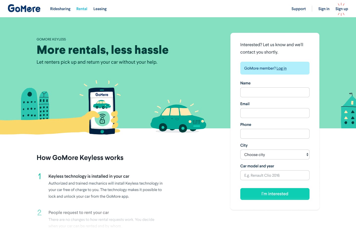
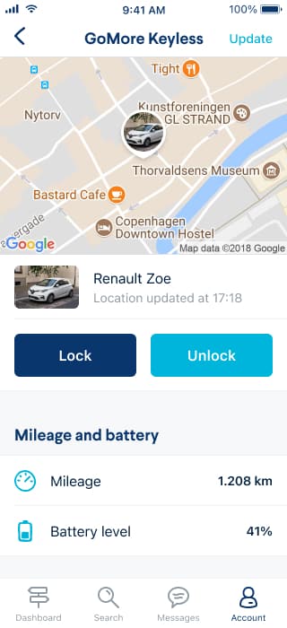
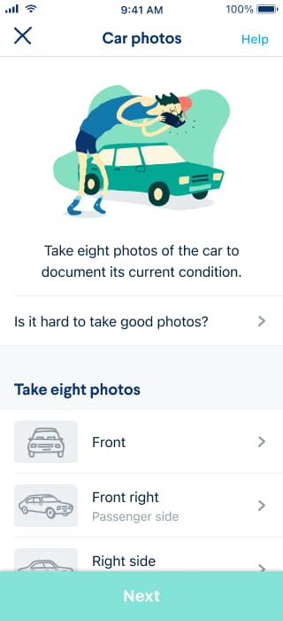
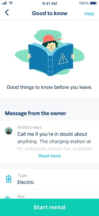
GoMore, 2019GoMore is a platform where people share cars. I led the development of GoMore Keyless which allows car owners to rent out their car to strangers without ever meeting.
The project included installing physical hardware in the cars to read the fuel level and mileage, get its location and control the lock. That was fun, and not easy.
The Keyless hardware is now installed in >1,000 cars across Europe.
My role: Product management, design, frontend.
Finding your driver
GoMore, 2018GoMore is also a platform where people share rides with other people heading in the same direction.
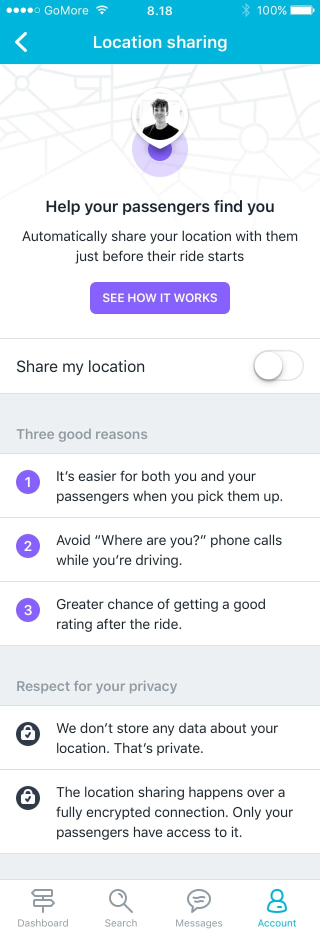
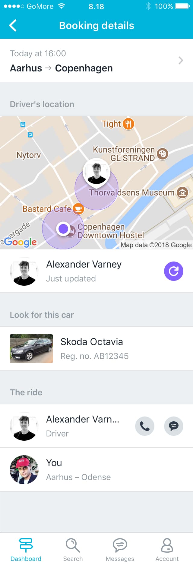
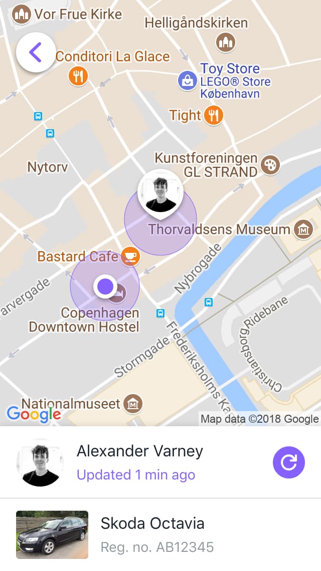
One friction point is that it can sometimes be hard to find your driver or passengers when it’s time to meet. I designed a location sharing feature to solve that problem.
We decided not to build the feature, but I still like the concept and design.
My role: Design.
Colorful car leasing
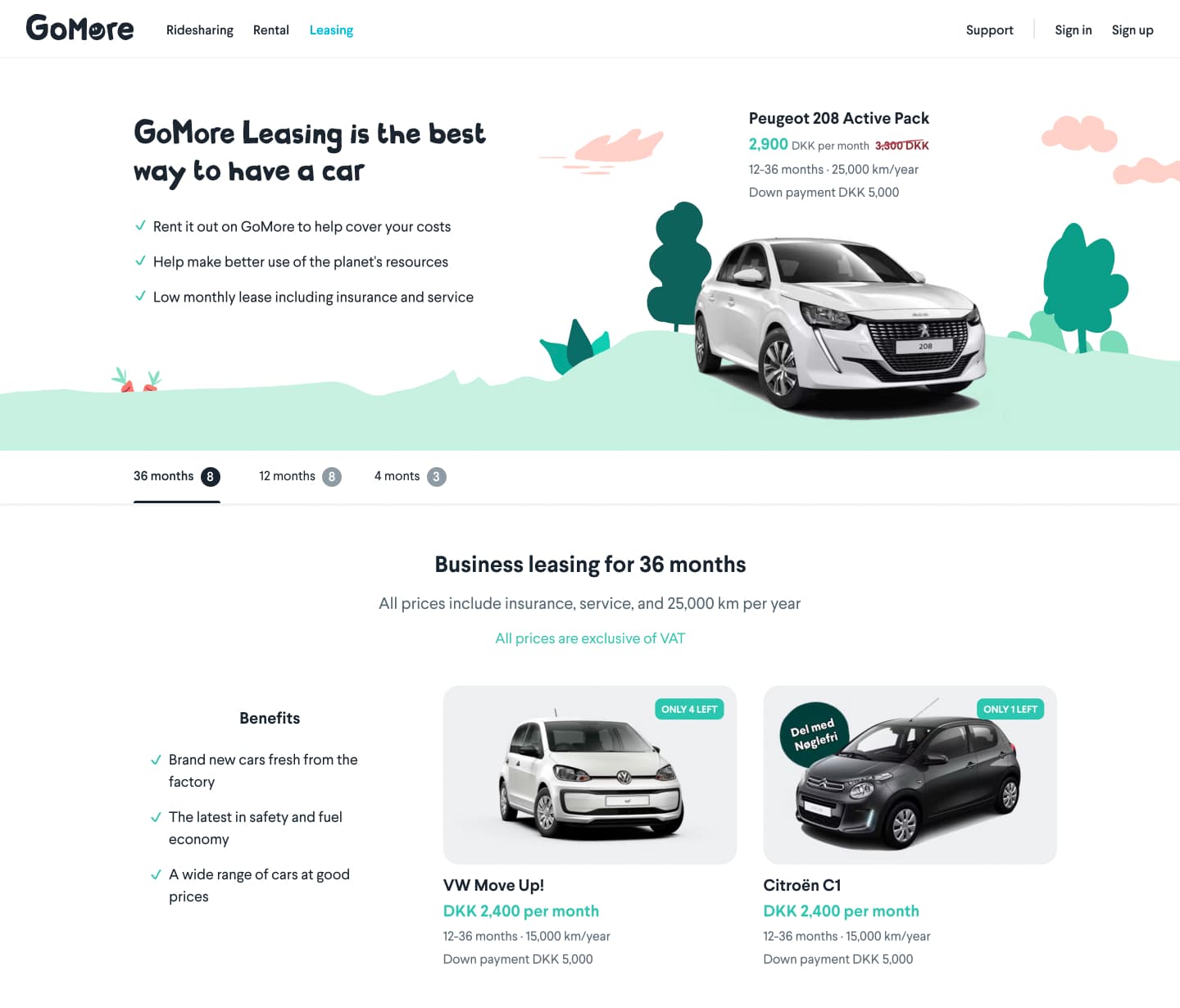
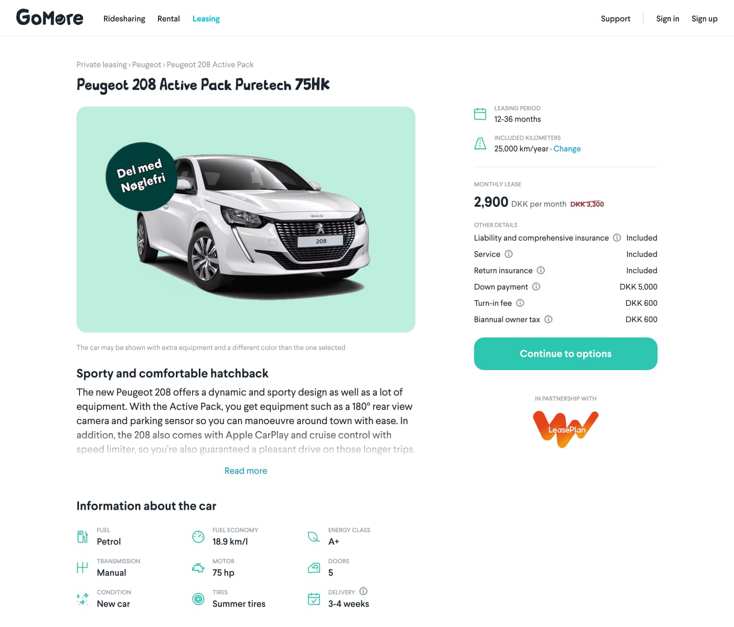
GoMore, 2018On GoMore you can lease a car and share it with other people to decrease the monthly lease.
I was the primary designer on everything leasing related. Our goal was to build a leasing platform that aligned with GoMore's human, social and playful design principles.
My role: Design, frontend.

Blog redesign
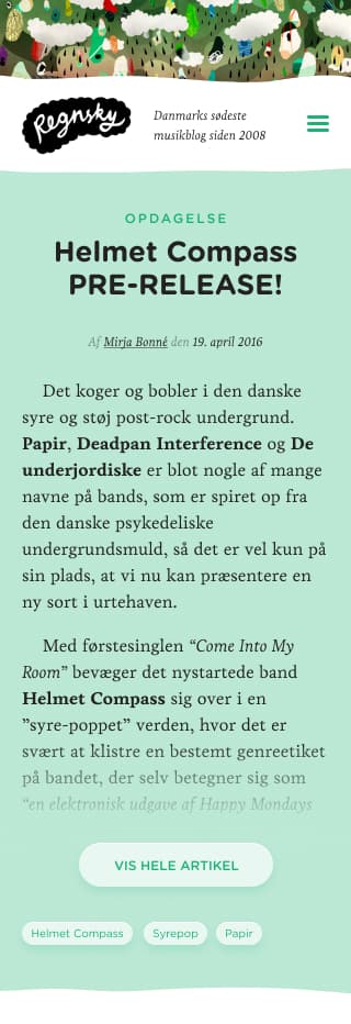
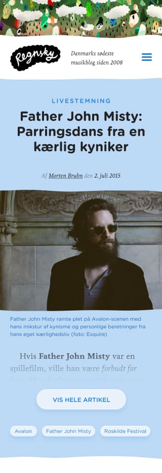
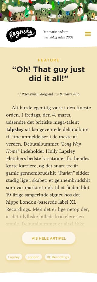
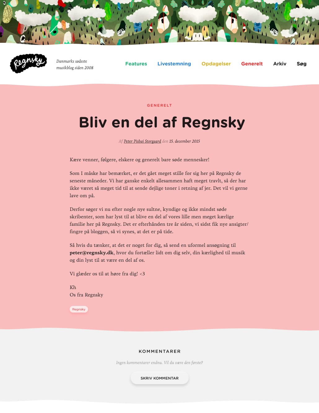
Regnsky, 2016Regnsky was a popular music blog among the Danish indie youth. They asked if I could do a redesign.
We agreed on the keywords Cute, Friendly, Colourful, and Handmade. Seven years later I still think the design does a good job of capturing those keywords.
The illustration in the header, by Hvass&Hannibal, is the only thing I carried over from the old design.
My role: Design, frontend.
Motivating students to read
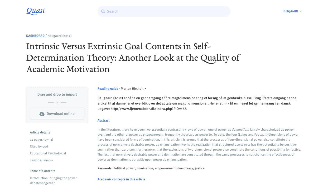
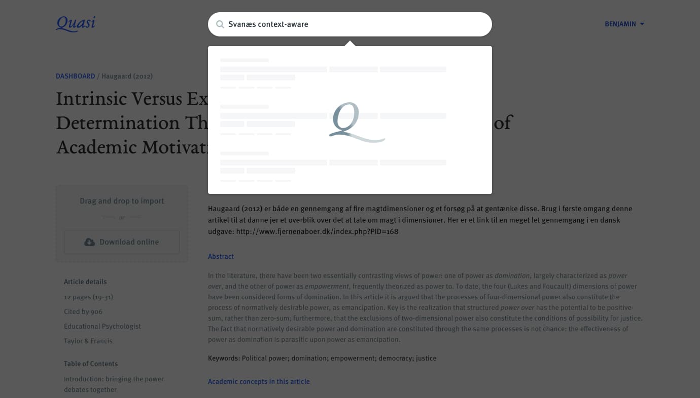
Research, 2016I was not the most motivated student. That’s why I decided to build Quasi with Simon Lind and Andreas Reffstrup to see if we could build a platform that motivated students to read more academic literature.
We built Quasi as a prototype and tested it with 6 students during a week of real study.
Our research showed that a digital study platform can indeed motivate students to read more if it focuses on making the literature more relevant and easier to understand. Social features can also add some healthy peer pressure.
My role: Design, research.
Scroll to top